At Utilish, we’re passionate about crafting tools that make your life easier without the hassle. Our design philosophy revolves around simplicity, clutter-free interfaces, no sign-ups, and a privacy-first approach—principles that define every tool on our site. Paired with our iconic purple aesthetic, this approach creates an experience that’s both beautiful and functional. In this post, we’ll pull back the curtain on how we design Utilish tools and why these choices matter to you.
The Core of Utilish Design
Utilish tools are built on a foundation of four key principles that guide our creative process:
- Simplicity: We strip away complexity to focus on what matters—your task. Whether it’s converting text with Case Converter or compressing an image with Image Compressor, our interfaces are intuitive and straightforward, letting you get to work instantly.
- Clutter-Free: No overwhelming menus or unnecessary features—just the essentials. Our clean layouts ensure you can find what you need without distraction, making tools like Text Counter or Quick ZIP a breeze to use.
- No Sign-Ups: We believe your tools should be ready when you are. Unlike many platforms, Utilish requires no registration, so you can start using Text Splitter or Password Tools the moment you land on our site.
- Privacy-First: Your data stays yours. With all processing done client-side in your browser, tools like Text Trimmer or Image Annotator never send your information to servers, aligning with our commitment to privacy.
These principles shape every aspect of Utilish, from the layout to the user experience, ensuring you can trust and enjoy our tools.
The Purple Aesthetic: More Than Just a Color
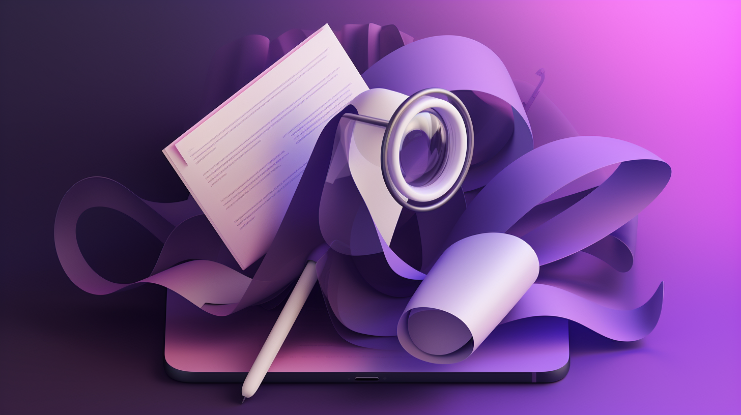
Our purple color scheme—spanning soft lavender to deep purple—is more than a visual choice; it’s a reflection of our brand. Purple evokes trust, creativity, and a modern feel, resonating with our privacy-focused mission. This consistent palette ties together tools like Text Tools and Image Tools, making Utilish instantly recognizable. The gradient background and purple buttons create a calming, confident space where you can focus on your work, knowing your privacy is protected.
Why This Design Works for You
The design of Utilish tools directly enhances your experience. The simplicity and lack of clutter mean you can format a blog post with Case Converter or extract data with Text Extractor without wading through extra steps. No sign-ups save you time, letting you jump into Image Compressor for a quick file optimization. And the privacy-first approach ensures your sensitive text or images stay local, giving you peace of mind. Whether you’re a student organizing notes or a developer encoding URLs, our design makes every task smoother.
Explore Utilish Today
We’re excited to share the story behind our tools’ design. Try out our Text Tools or Image Tools to experience it yourself. Have feedback on our design? We’d love to hear it—reach out via our Contact page. Stay tuned for more insights into how Utilish keeps it simple and secure!